Corporate Identity: Brenton Porter Architect
Brenton lives in my home town of Newcastle and was considering starting something small and boutique in his field.
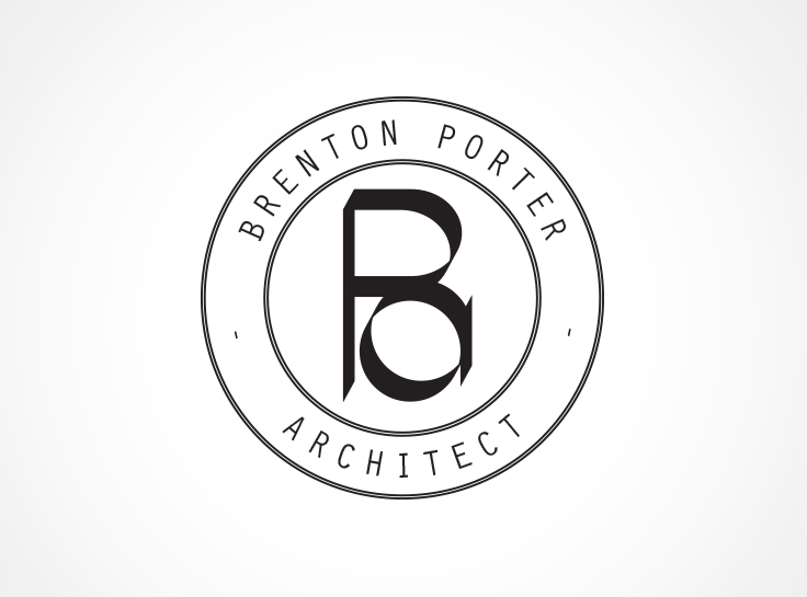
Architecture is an industry I find interesting. It somehow fuses the creative and corporate worlds to form something so tangible and physical, despite the creative and corporate spaces being so inherently intangible. With this fusion in mind I worked up a modern monogram using the BP initials and BPA acronym.
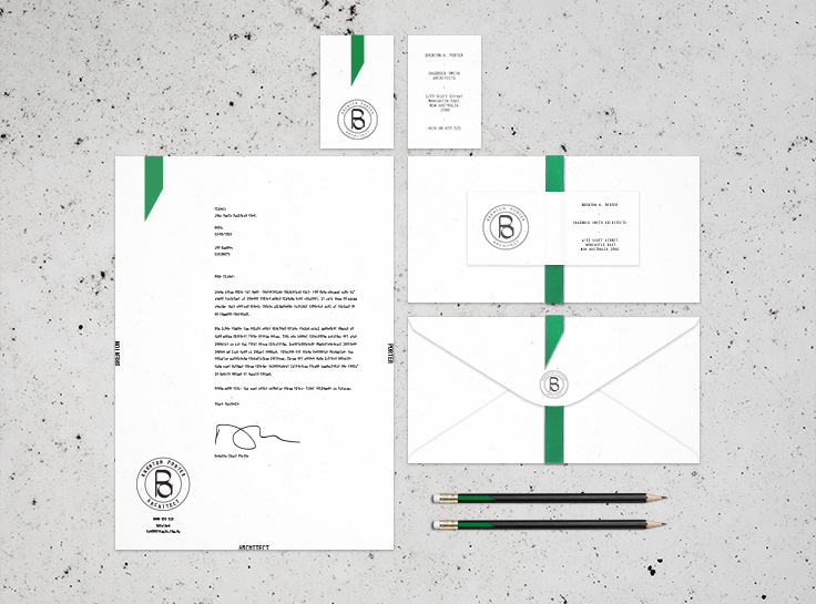
First impressions count. The visual identity had to be corporate enough to look professional - not just to Brenton's potential clients, but Government departments and councils - and yet it still needed to be recognisable as creative and as outside-of-the-box as Brenton is.
I used the green accent because it is suggestive of the natural world, and eco focus of architecture these days. I also wanted to give a sense of authority and professionalism to the design, throwing back to the old days when documents were sealed and sown.
These elements combine to build an identity that could stand alone, have application online, and still look great throughout the necessary paperwork of a typical office environment.


